플러터(Flutter) 버튼(Button) 알아보기
플러터에는 ElevatedButton, OutlinedButton, TextButton 버튼 등이 있으며 이를 알아보고 style을 통해 꾸미는 방법을 알아보도록 하겠다.

// ignore_for_file: prefer_const_constructors
import 'package:flutter/material.dart';

class HomeScreen extends StatelessWidget {
  const HomeScreen({super.key});

  @override
  Widget build(BuildContext context) {
    return Scaffold(
      appBar: AppBar(
        title: Text('Button'),
      ),
      body: Padding(
        padding: const EdgeInsets.symmetric(
          horizontal: 15.0,
        ),
        child: Column(
          mainAxisAlignment: MainAxisAlignment.center,
          crossAxisAlignment: CrossAxisAlignment.stretch,
          children: [
            ElevatedButton(
              onPressed: () {},
              child: Text('ElevatedButton'),
            ),
            OutlinedButton(
              onPressed: () {},
              child: Text('OutlinedButton'),
            ),
            TextButton(
              onPressed: () {},
              child: Text('TextButton'),
            ),
          ],
        ),
      ),
    );
  }
}
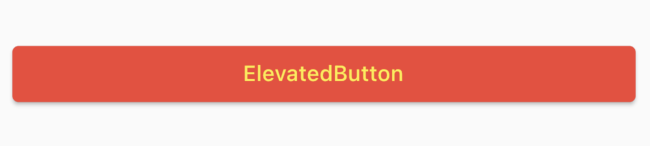
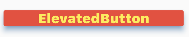
ElevatedButton
입체감이 있는 버튼이다.
ElevatedButton(
              onPressed: () {},
              style: ElevatedButton.styleFrom(

                  ),
              child: Text('ElevatedButton'),
            ),
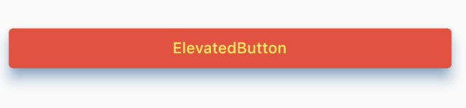
backgroudColor
버튼의 배경색을 바꿔준다.
backgroundColor: Colors.red,

foregroundColor
버튼의 글씨색상을 바꿔준다.
foregroundColor: Colors.yellow,
shadowColor | elevation
버튼의 입체감을 주는 그림자의 색상을 설정할 수 있다.
shadowColor: Colors.blue,
textStyle : fontWeight
                textStyle: TextStyle(
                  fontWeight: FontWeight.w900,
                  fontSize: 30.0,
                ),
FontWeight.w100
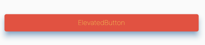
FontWeight.w900
fontSize: 30.0
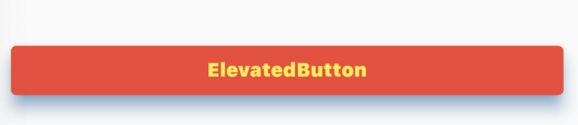
padding
버튼 내의 여백을 준다
padding: EdgeInsets.all(50.0))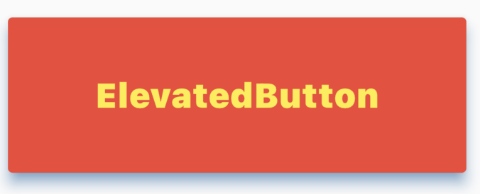
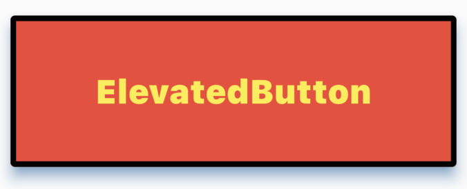
side: BorderSide()
테두리의 속성을 정할 때 사용한다.
                side: BorderSide(
                  color: Colors.black,
                  width: 5.0,
                ),
전체코드
// ignore_for_file: prefer_const_constructors
import 'package:flutter/material.dart';

class HomeScreen extends StatelessWidget {
  const HomeScreen({super.key});

  @override
  Widget build(BuildContext context) {
    return Scaffold(
      appBar: AppBar(
        title: Text('Button'),
      ),
      body: Padding(
        padding: const EdgeInsets.symmetric(
          horizontal: 15.0,
        ),
        child: Column(
          mainAxisAlignment: MainAxisAlignment.center,
          crossAxisAlignment: CrossAxisAlignment.stretch,
          children: [
            ElevatedButton(
              onPressed: () {},
              style: ElevatedButton.styleFrom(
                // 글자 배경색 설정
                backgroundColor: Colors.red,
                // 글자 색상 및 애니메이션 색 설정
                foregroundColor: Colors.yellow,
                // 글자 그림자 설정
                shadowColor: Colors.blue,
                // 글자 3D 입체감 높이
                elevation: 10.0,
                textStyle: TextStyle(
                  fontWeight: FontWeight.w900,
                  fontSize: 30.0,
                ),
                padding: EdgeInsets.all(50.0),
                side: BorderSide(
                  color: Colors.black,
                  width: 5.0,
                ),
              ),
              child: Text('ElevatedButton'),
            ),
          ],
        ),
      ),
    );
  }
}
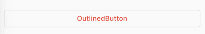
OutlinedButton
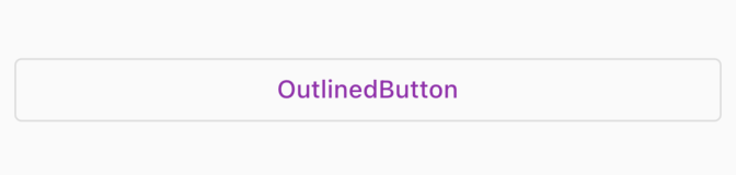
            OutlinedButton(
              onPressed: () {},
              style: OutlinedButton.styleFrom(),
              child: Text('OutlinedButton'),
            ),
foregroundColor
버튼의 글씨색상을 바꿔준다.
foregroundColor: Colors.red,
backgroudColor
버튼의 배경색을 바꿔준다.
backgroundColor: Colors.yellow,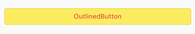
나머지에 해당되는 스타일 값들은 위에서 다룬 ElevatedButton의 스타일 값과 동일하게 적용이 된다.
TextButton
텍스트 버튼
foregroundColor
버튼의 글씨색상을 바꿔준다.
foregroundColor: Colors.red,
backgroudColor
버튼의 배경색을 바꿔준다.
backgroundColor: Colors.yellow,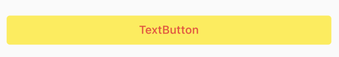
나머지에 해당되는 스타일 값들은 위에서 다룬 ElevatedButton의 스타일 값과 동일하게 적용이 된다.
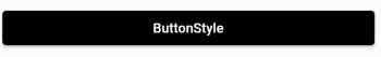
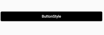
ButtonStyle
styleFrom 함수는 ButtonStyle을 쉽게 사용할 수 있도록 설계가 되어 있는 함수이다. 그렇기에 원래는 ButtonStyle을 사용해서 버튼의 스타일을 적용한다.
styleFrom 보다 직관적으로 스타일을 지정할 수 있다. 아래의 ButtonStyle 괄호 안에 작성한다.
            ElevatedButton(
              onPressed: () {},
              style: ButtonStyle(),
              child: Text('ButtonStyle'),
            )
MaterialStateProperty.all
이는 모든 상태에서 똑같은 값을 적용하겠다는 의미이다. styleFrom 하고 같은 기능이다.
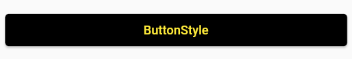
            ElevatedButton(
              onPressed: () {},
              style: ButtonStyle(
                backgroundColor: MaterialStateProperty.all(
                  Colors.black,
                ),
                foregroundColor: MaterialStateProperty.all(
                  Colors.yellow,
                ),
              ),
              child: Text('ButtonStyle'),
            )
MaterialStateProperty.resolveWith
버튼의 상태가 바뀔 때 상태의 값에 따라 버튼의 스타일을 정해줄 수 있다.
버튼을 눌렀을 때
글씨체 빨간색, 배경 초록색으로 변경
backgroundColor와 foreg
            ElevatedButton(
              onPressed: () {},
              style: ButtonStyle(
                backgroundColor: MaterialStateProperty.resolveWith(
                    (Set<MaterialState> states) {
                  if (states.contains(MaterialState.pressed)) {
                    return Colors.green;
                  }
                }),
                foregroundColor: MaterialStateProperty.resolveWith(
                    (Set<MaterialState> states) {
                  if (states.contains(MaterialState.pressed)) {
                    return Colors.red;
                  }
                }),
              ),
              child: Text('ButtonStyle'),
            )
MaterialState.
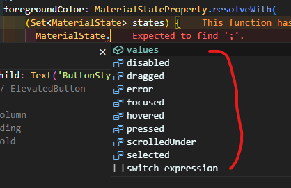
focused : 포커스 되었을 때 ex) 커서가 깜빡이는 상태
hovered : 마우스 커서를 올려놓은 상태
disabled : 비활성화 상태
dragged : 드래그 되었을 때
error : 에러 상태
pressed : 눌렸을 때
scrolledUnder : 다른 컴포넌트 아래로 스크롤되었을 때 ex) 리스트뷰 등 다른 컴포넌트 밑에 가려져 있을 떄
selected : 체크 박스, 라디오 버튼 등이 선택되었을 때
padding: MaterialStateProperty.resolveWith
버튼이 클릭되었을 때 패딩에 스타일 적용하기
            ElevatedButton(
              onPressed: () {},
              style: ButtonStyle(backgroundColor:
                  MaterialStateProperty.resolveWith(
                      (Set<MaterialState> states) {
                if (states.contains(MaterialState.pressed)) {
                  return Colors.green;
                }
                return Colors.black;
              }), foregroundColor: MaterialStateProperty.resolveWith(
                  (Set<MaterialState> states) {
                if (states.contains(MaterialState.pressed)) {
                  return Colors.red;
                }
              }), padding: MaterialStateProperty.resolveWith(
                  (Set<MaterialState> states) {
                if (states.contains(MaterialState.pressed)) {
                  return EdgeInsets.all(50.0);
                }
              })),
              child: Text('ButtonStyle'),
)'Flutter > Flutter Study' 카테고리의 다른 글
| [Flutter] showDatePicker 한국어 바꾸기 / DatePicker 데이트피커 한국어 변경 (0) | 2023.04.28 |
|---|---|
| [Flutter] BOTTM OVERFLOWED BY PIXELS 해결 방법 모음 (0) | 2023.04.22 |
| [Flutter] 위젯 간의 데이터 전송 / 스크린 이동 / Navigator, ModalRoute, Named Route (0) | 2023.03.16 |
| [Flutter] 드로어(Drawer) 메뉴 만들기 | 플러터 네비게이션 드로어 (Navigation Drawer) 메뉴 (0) | 2023.02.15 |
| [Flutter] AppBar 앱바 만들기 | DEBUG 리본 없애기 | 메뉴 아이콘 추가하기 (0) | 2023.02.15 |
| [Flutter] Stateless 위젯을 Stateful 위젯으로 바꿔보기 (0) | 2023.02.08 |


댓글